Are you certain your website is hitting the mark and making a good first impression?
If it isn’t, chances are it is costing you tons of missed sales and hemorrhaging your promotional budget for unsuccessful conversions.
The modern-day buyer is quite skeptical, and the statistics show just as much. According to an eCommerce Wiki report, 88% of your customers look you up before initiating any interaction with your business.
So if your website is not appealing, a lot of your leads are not converting because your clients are judging you even before hearing you out.
But what can you do to change that?
By learning how to make a good first impression online.
In this guide, we’ll be discussing how to use your website to make a lasting impression on your customers for successful lead generation.
Let’s dive right in.
1. Use Conscious Colors With A Purpose
The color scheme of your website affects your clients in more ways than you know.
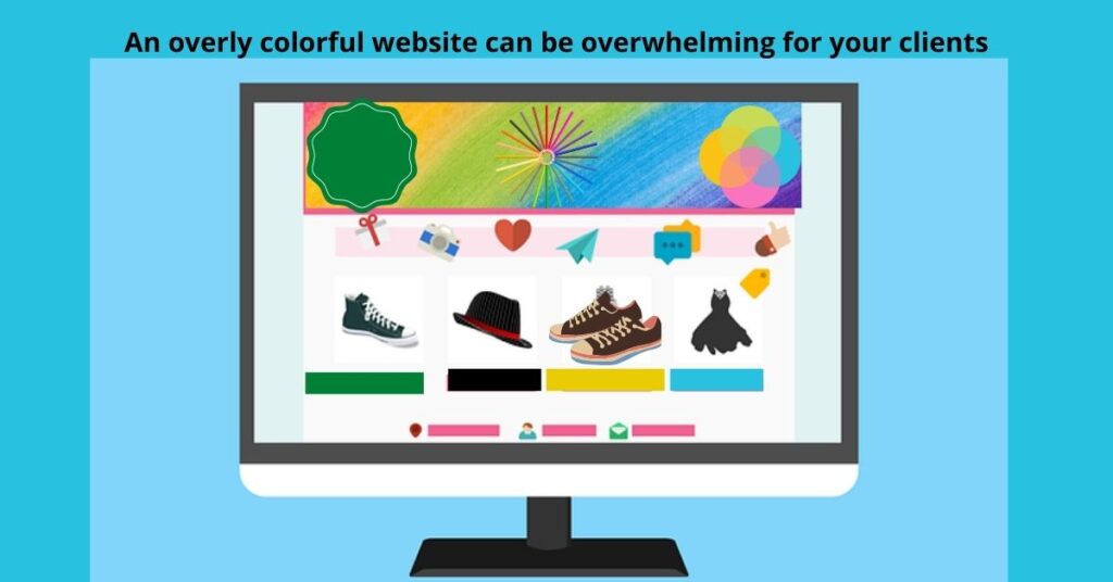
When every shade on your website is striking and powerful, the result is that what you want to stand out doesn’t.
A chaotic blend of colors can be dizzying for your clients, and it may be putting off leads instead of offering invitations.
To prevent that, the general rule of thumb is to use between two and four colors for your website color scheme.
You need to be well-informed about the psychology of color before you pick out a template for your website.
We associate colors with certain feelings because of how our minds get accustomed to what we see around us. This is according to information from a Sage study.
For example, when you think of green, mostly nature and vitality come to mind, while red invokes excitement or appetite. Blue, on the other hand, speaks to a certain calmness within us while dark and muted colors set a more somber mood.
In line with what your business stands for, you’ll want to choose a color that paints your brand in a good light. Make a good first impression with your website by choosing hues associated with positivity.
2. Ensure Minimal Website Loading Times
Have you ever visited a website that took ages to load up?
Chances are, you probably thought that the waiting time wasn’t worth it, so you moved on swiftly to the next alternative.
With poor page speed, your clients may not even be sticking around to see that killer website your business has to offer.
A performance report by Akamai finds that 53% of mobile viewers give websites only 3 seconds to load before calling it quits.
In other words, one out of two leads leaves if your page loads for more than 3 seconds. Hence your promotional material is not even being seen by half of your market if your website is not loading quickly.

You can speed up your website by optimizing your images and videos, among other methods.
JPG formats are advisable when you’re downloading images for your website because these are already compressed. TIFF and BMP tend to be a lot bulkier
Then, you’d want to size and compress your images appropriately. The same applies to video.
Additionally, WordPress cache plugins will decrease loading times for your cached web pages.
There are a ton of other technical improvements you can make but you may want to invest in web design for expert assistance.
3. Design An Excellent Logo For Your Website
Your brand or website logo is another important factor when it comes to mastering how to make a good first impression online.
A bland logo is quickly forgotten seconds after your client leaves your website. It doesn’t stir up emotion and consequently doesn’t get talked about as much as you’d like.
I’d not recommend a DIY logo either, because it likely won’t cut the mustard. You may lack the necessary tools and know-how, especially regarding color theory.
According to a report by Finances Online, logo color accounts for 90% of that first impression your clients get from your logo. And there are MANY other aspects to consider as well, such as your target market and associated stereotypes.
Save yourself the trouble and get a great, unique logo when you invest in logo design services.
When you go at it alone, you’ll likely create a logo similar to big brands that subconsciously influence you. You may also make a generic design that looks a lot like your competitors’.
Our professional logo design team can get you an original design that has excellent market memorability and builds loyalty.
4. Avoid Unnecessary Media Or Pop-Ups
Have you ever barely made it into a website and before you can read anything on the page, there are several pop-ups in your face?
Annoying, isn’t it?
Your clients think so too. If your website is filled with so many pop-ups, not only are you putting off your market, but you’re also jeopardizing your SEO rankings by increasing page loading time.
And no you shouldn’t avoid pop-ups altogether, because a Sumo survey states that pop-ups can boost conversion rates by 50%.

The key is to learn how to find the right balance so you make a good first impression with your website via strategic and relevant pop-ups.
For example, a good pop-up should appear in the least disturbing section of your website. It should not be the first thing your web visitors see.
Secondly, it should be relevant to the page your client is viewing.
Timing is also another important factor when it comes to pop-up execution. Generally, you’d want pop-ups to appear somewhere around the halfway point of the average time that visitors spend on your website.
5. Don’t Forget to Optimize For Mobile
Did you know that most of your web visitors are on mobile?
According to a Google report, mobile phones account for more than half of all web traffic. So if your website is not looking great on a small screen, you’re putting on a bad show in front of 50% of your leads.
When you optimize only for desktops, most of your market is contending with problems like illegible fonts and erroneous web buttons and layouts.
You’ll find that some of the content accessible on desktop is missing on mobile.
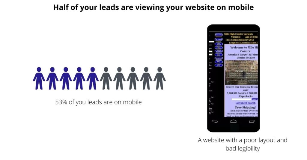
Therefore, to make a good first impression with your website, prioritize mobile friendliness.
Improving page speed on mobile will help you achieve that, and so too will well-compressed images and adaptable website layouts.
Additionally, you can use Google Search Console, previously known as Google Webmaster Tools, to identify and fix crawling problems and mapping issues.
You can perform a mobile-friendly test by pasting the URL of one of your web pages into Google’s mobile-friendly test section on GSC. Then, if it is not well optimized for mobile, Google will tell you exactly what’s wrong with it. E.g., you may get a report saying “the text is too small to read,” etc.
Conclusion
Your website is your calling card on the internet, and the truth of the matter is that your leads WILL judge you by its cover.
When you walk into a hotel, you instantly know whether or not to expect great service depending on the décor or customer service.
It’s the same thing with your business, where your website is the virtual front door that prospective clients walk into, and consequently make assumptions or expectations based on first-glance observations.
If your website is well-designed, it offers your business the opportunity to make a lasting impression and get new clients talking about you.
Do you need help with how to make a good first impression with your website?
Click here to talk to our web design experts.


